Hi Friends,
Recently I was discussing some WPF stuff with one of my friends and we come up with this Nice article Here we are going to discuss about creating a Control template and how the communication between them is done. This is quite useful and
important to understand the Control template, this will make the life easy by reusing the same template for multiple time if required in the same application.
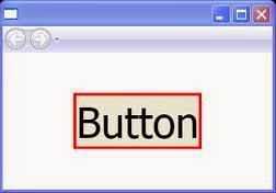
By Theory The definition of Control Template is "Specifies the visual structure and behavioral aspects of a Control that can be shared across multiple instances of the control. Mean we will set the behavior of the controls once and the same will be applied where ever we will use this. Like We want to create a Control or lets say Button like this.
The standard WPF controls all come with default templates that produce the default control
appearances. You can, however, replace those templates with ones of your own design, giving the controls an entirely different appearance. Here is an example of that. Let’s create a sample button
<StackPanel> <Button FontWeight="Bold" Click="myButton Click" Name="myButton"> Click Me </Button></StackPanel>private void myButton Click( object sender, RoutedEventArgs e ){ MessageBox.Show( "Button Clicked", "Button Message" );}
To illustrate these concepts, I’ll start with a simple button that uses the default Button template and then replace its control template. The following is the markup that produces a standard button
<StackPanel><Button FontWeight="Bold" Click="myButton Click" Name="myButton"> Click Me</Button></StackPanel>
The next thing I want to do is to create a control template and substitute it for the default Button template. The appearance I want for the button consists of a Border containing a TextBlock
<Window.Resources> <ControlTemplate x:Key="myButtonTemplate" > <Border Padding="5" Background="AliceBlue" BorderBrush="Green" BorderThickness="5" HorizontalAlignment="Center" CornerRadius="5"> <TextBlock Text="Control Templates Content"></TextBlock> </Border> </ControlTemplate> </Window.Resources>
---------------------------------------------------------------------------------------------------------------------
<StackPanel> <Button FontWeight="Bold" Template="{StaticResource myButtonTemplate}" Click="Button_Click" Content="Buttons Content1" Name="myButton"> </Button> </StackPanel>
Let’s run this
It will show Control Template Content. it will not show Buttons content.
To show the Buttons content we need to make following changes
- Set the TargetType attribute of the ControlTemplate to Button, as shown in the
following markup line:
- Replace the TextBlock object, which produces the specific output string, with a ContentPresenter object.
To accomplish this, I need to use an object that can retrieve the Content from the templated parent and display that content. The class designed to do this is the ContentPresenter class. To use this, I needed to make two changes to the template declaration they generate the presentation of content to the user interface
The following are some important things to know about the ContentPresenter class:
- • The ContentPresenter object acts as a placeholder inside the template to specify where the content should be placed.
- • By default, the ContentPresenter gets the actual content from the templated parent and binds it to its own Content property. As a matter of fact, the ContentPresenter doesn’t event allow direct content of its own.
- • To use a ContentPresenter, you must set the TargetType attribute of the ControlTemplate to the type of the templated parent.
Template Binding
There are times, however, when you might want the ContentPresenter to use additional properties from the templated parent. The TemplateBinding class is a special type of binding designed for this purpose.
Now I will set the Height and width property of the Button from the Control Template, but it will read the values from the parent Button which is set as Target Type.
<ControlTemplate x:Key="myButtonTemplate" TargetType="Button"> <Border Padding="5" Background="AliceBlue" BorderBrush="Green" BorderThickness="5" HorizontalAlignment="Center" CornerRadius="5" > <ContentPresenter Width="{TemplateBinding Width}" Height="{TemplateBinding Height}" /> </Border> </ControlTemplate> <StackPanel> <Button FontWeight="Bold" Template="{StaticResource myButtonTemplate}" Click="Button_Click" Content="Buttons Content1" Name="myButton" Width="180" Height="40"> </Button> </StackPanel>
So some of the important point is
- The appearance of every control is determined by a ControlTemplate object, which specifies the tree of visual elements to be displayed to represent the control.
- The control object represented by its visual tree is called the templated parent.
- The visual tree of a program consists of the tree comprising the templated parents and their visual trees.
- Inside a ControlTemplate, you can use a ContentPresenter object to display the Content property of the templated parent.
- You can use a template binding to read and use other dependency property values from the templates parent.
This Article is also published on Technet by one of my Best friend Hemant. You can Also refer this Here. "Control Template ". Please provide your thoughts and idea on Control template and or in WPF.


No comments:
Post a Comment